Indigo Phoenix — Full Brand & Web Redesign
Indigo Phoenix is a creative marketing agency based in Athens, operating since 2018. They needed a complete rebrand, moving away from their existing identity toward something more minimal, modern and elevated. The goal was to position them as a boutique creative marketing studio without changing the name or losing the elegance the brand already carried.
Brand identity
- Designed a new logo and icon system
- Defined a new color palette, typography system and visual rules
- Developed brand guidelines covering photography direction, textures and graphic elements
- Created supporting brand collateral — business cards, email signature, case study template, pricing documents and proposal templates
Web design
- Designed the full website from scratch — homepage, work page, about page
- Designed the work page as a flexible template system, able to support multiple case study formats without a full redesign each time
- Built and deployed the site live on Vercel
- Fully responsive across desktop and mobile
Full brand and website delivered and live. Complete end-to-end ownership from identity through to deployed product.
Where the identity started.
Φοίνικας = ανύψωση / μεταμόρφωση
Ανακάλυψη κρυμμένου potential
Ανύψωση, μεταμόρφωση brand. Before → After
Indigo = Untapped potential / depth of each brand

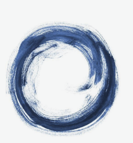




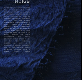


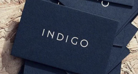
From the original mark to the final system.
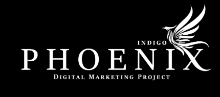
Ten early directions, testing how far the phoenix metaphor could stretch before it stopped reading as a mark.










Draft 11 was the original direction, but the linework fell apart at small sizes and broke down completely as a favicon. That constraint pushed the design toward draft 8 instead, simpler strokes that hold up at any scale.

Too many fine lines. Legible at large sizes, but collapsed into noise at favicon scale.
Simplified strokes that stayed legible from full lockup down to a 16px favicon. This became the base for the final mark.

Tested against both light and dark backgrounds to confirm contrast and legibility across use cases.
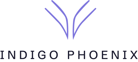
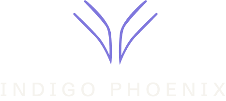


The foundation everything else is built on.
Color, type and voice, established during the website build, carried through every deliverable below.
Patterns, textures and iconography.
Supporting marks and surfaces that extend the identity beyond the logo itself.







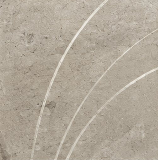
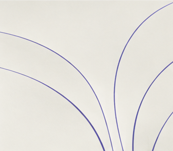



Physical surfaces referenced across print and packaging applications, kept subtle rather than decorative.



Every image in the system is graded with a restrained indigo undertone, present in the shadows and cooler midtones rather than pushed across the whole frame. It reads as intentional color temperature, not a filter, so the connection to the brand stays felt rather than announced.




The identity, applied.
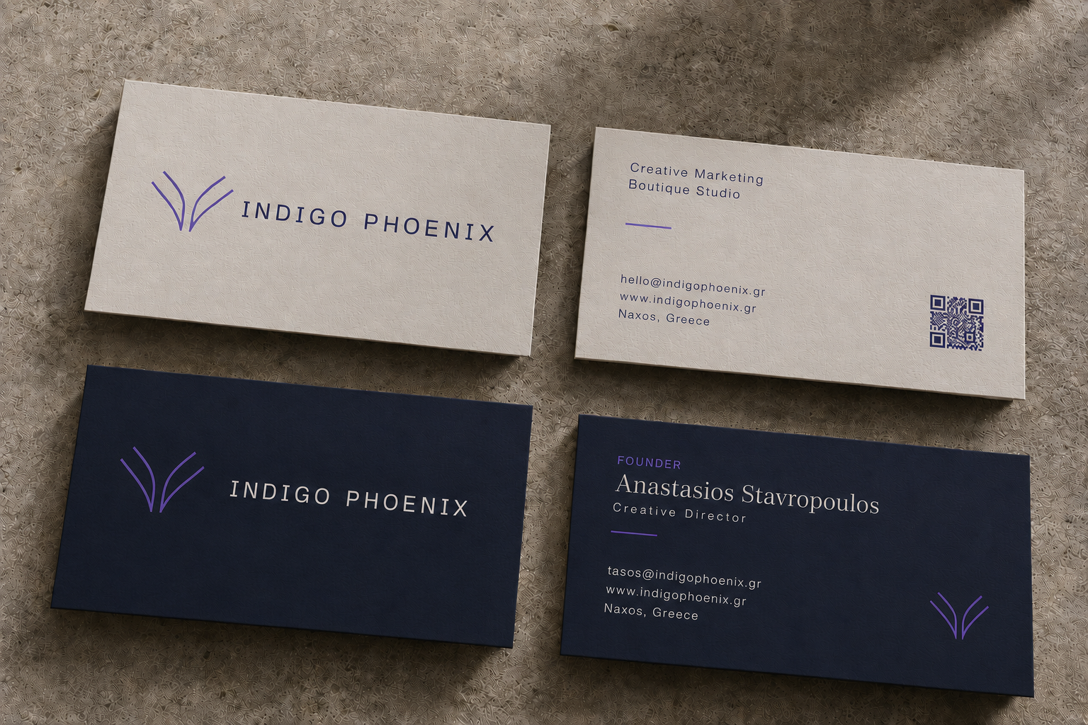
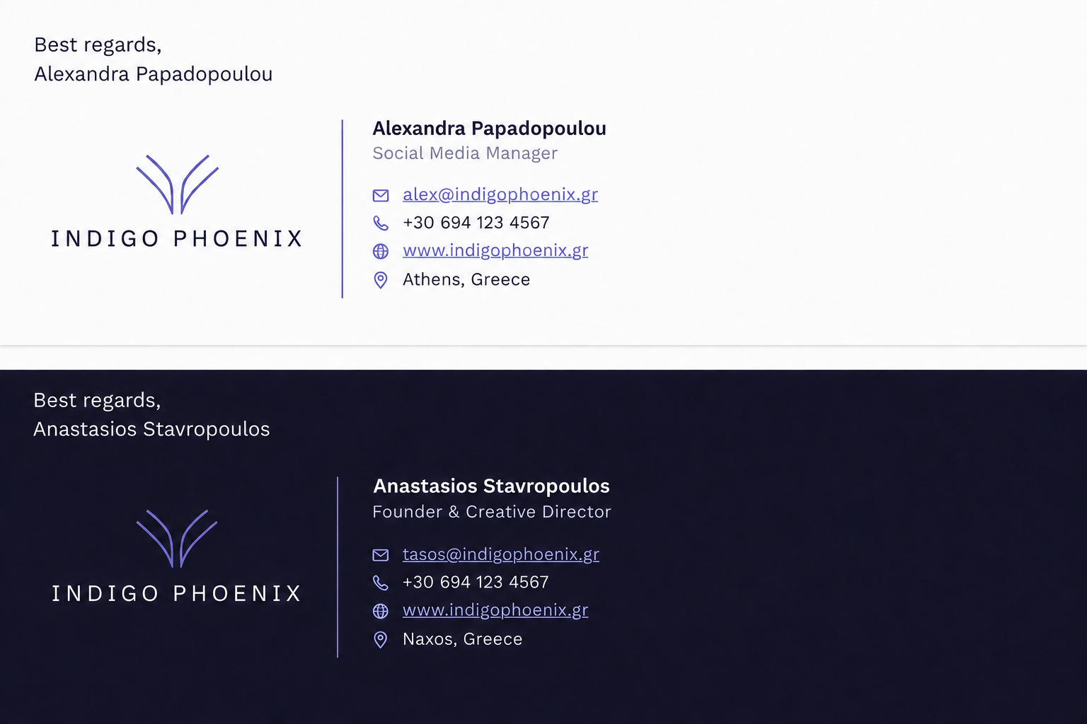
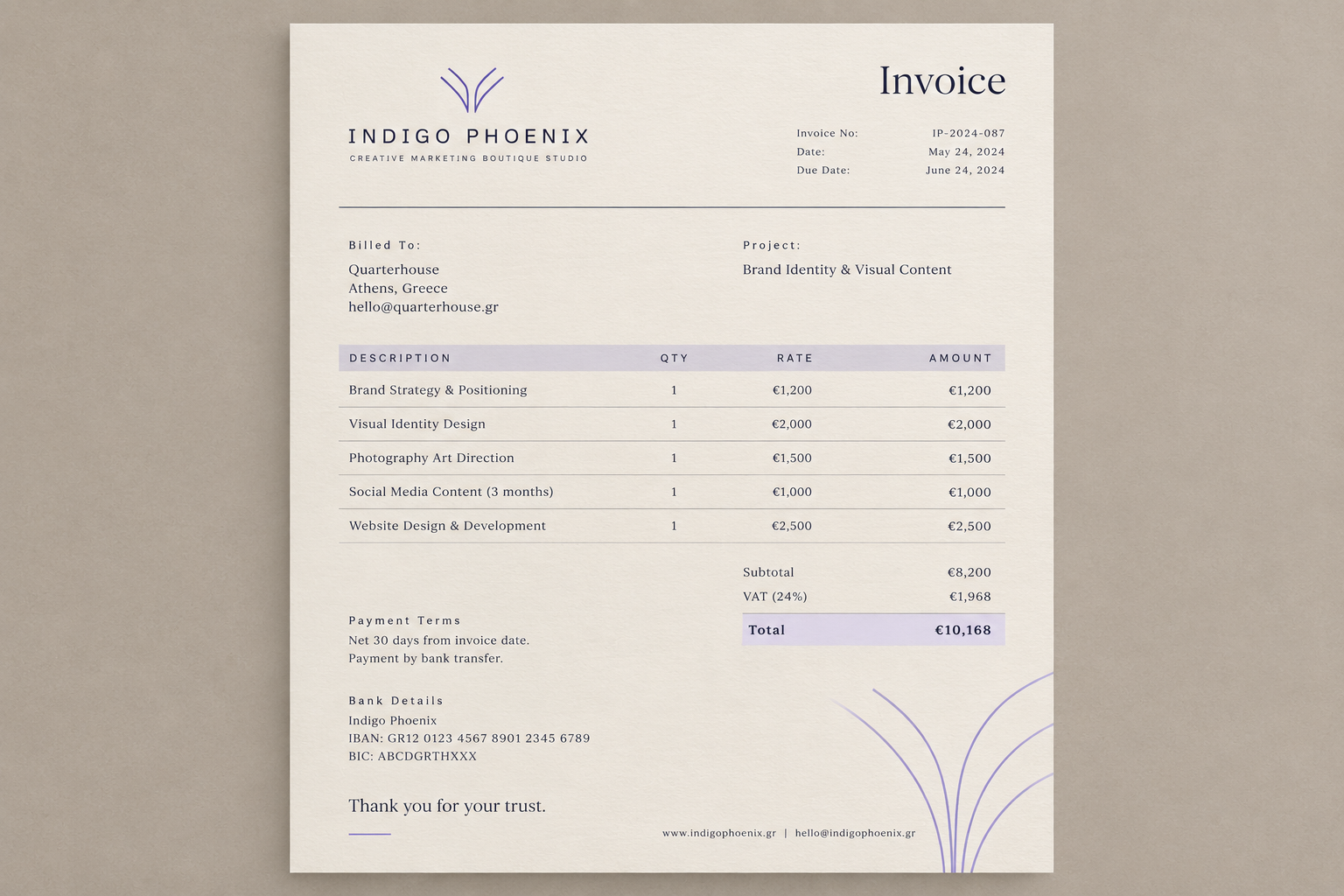
Business cards for the studio and its founder, email signatures, and invoice templates.
Pricing, proposal and deck.
Each document below is its own standalone page, embedded here so it can be reviewed inline.
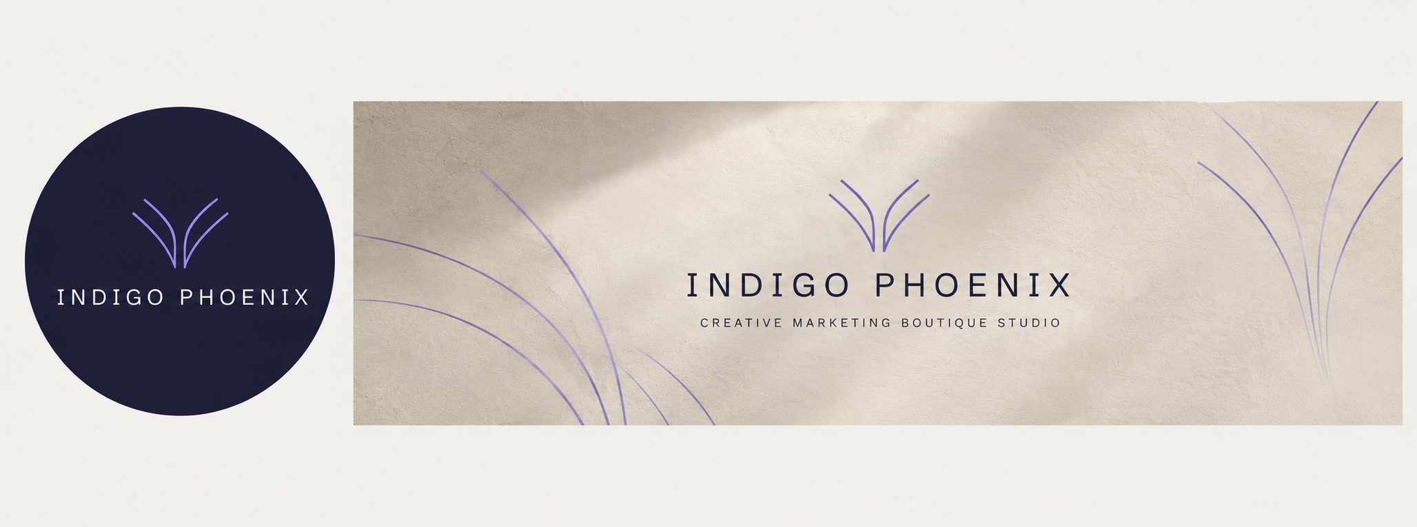
Profile, banner and the post system.
Same restraint carried onto the surfaces people actually scroll past every day.
Three initial posts, built to the same grid logic as the moodboard and graphic system above.


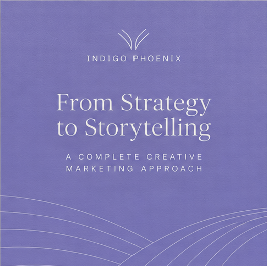
Every post above comes from the same underlying template: a large text zone that carries the headline, a smaller photo insert (roughly a quarter of the frame), and the mark placed differently on each layout rather than pinned to one corner. Swap the photo and the headline, keep the system, and the next month of content assembles itself instead of starting from a blank canvas.
The mark moves (top-left, top-center, bottom-right across the three posts above) but the ratio stays consistent: text carries most of the frame, the photo sits in as a smaller accent rather than filling the whole layout.
The centerpiece of the rebrand.
Everything above, mark, palette, type, grid logic, comes together here. This is where the identity actually gets used.
Their actual site, as it existed going into this project.
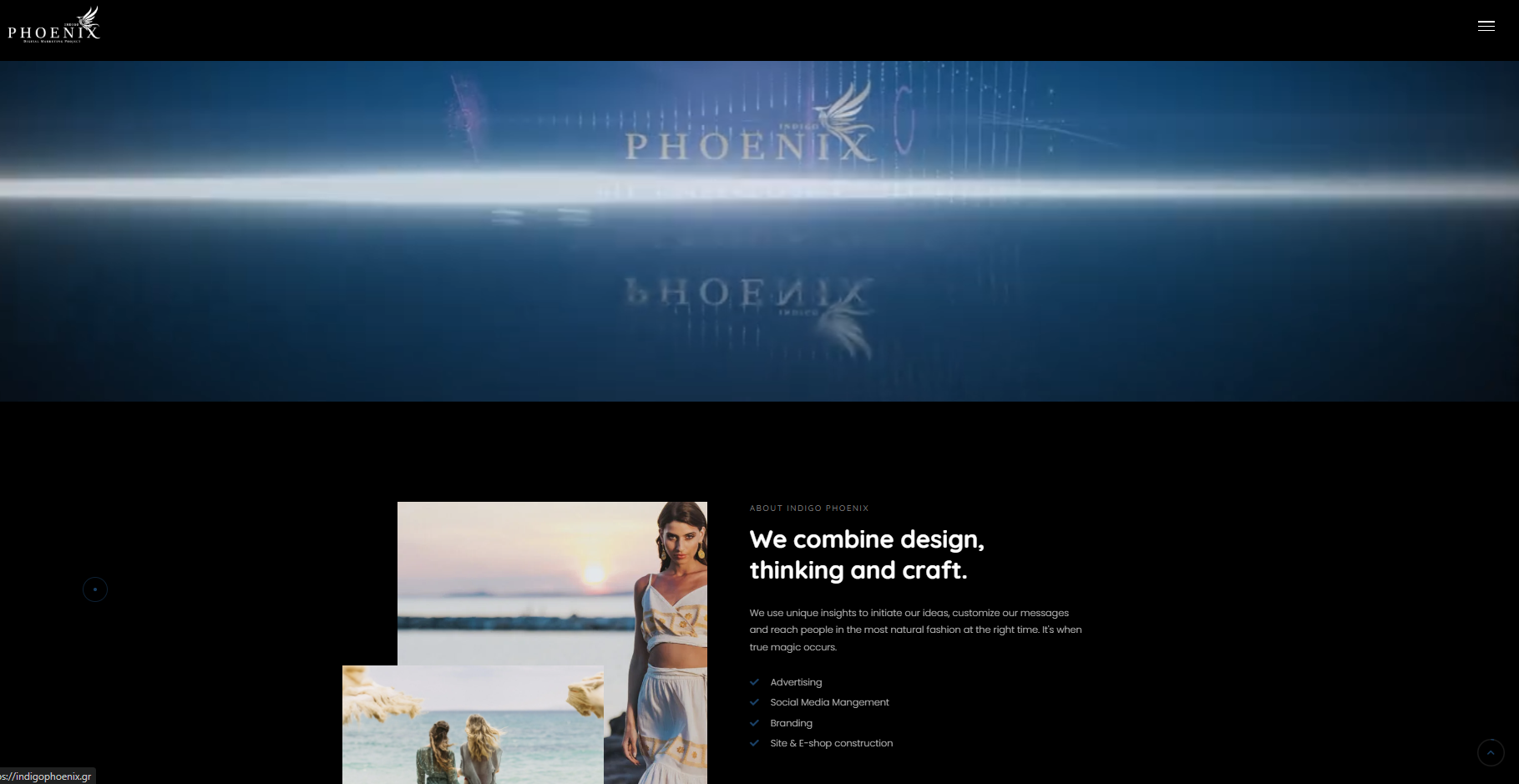
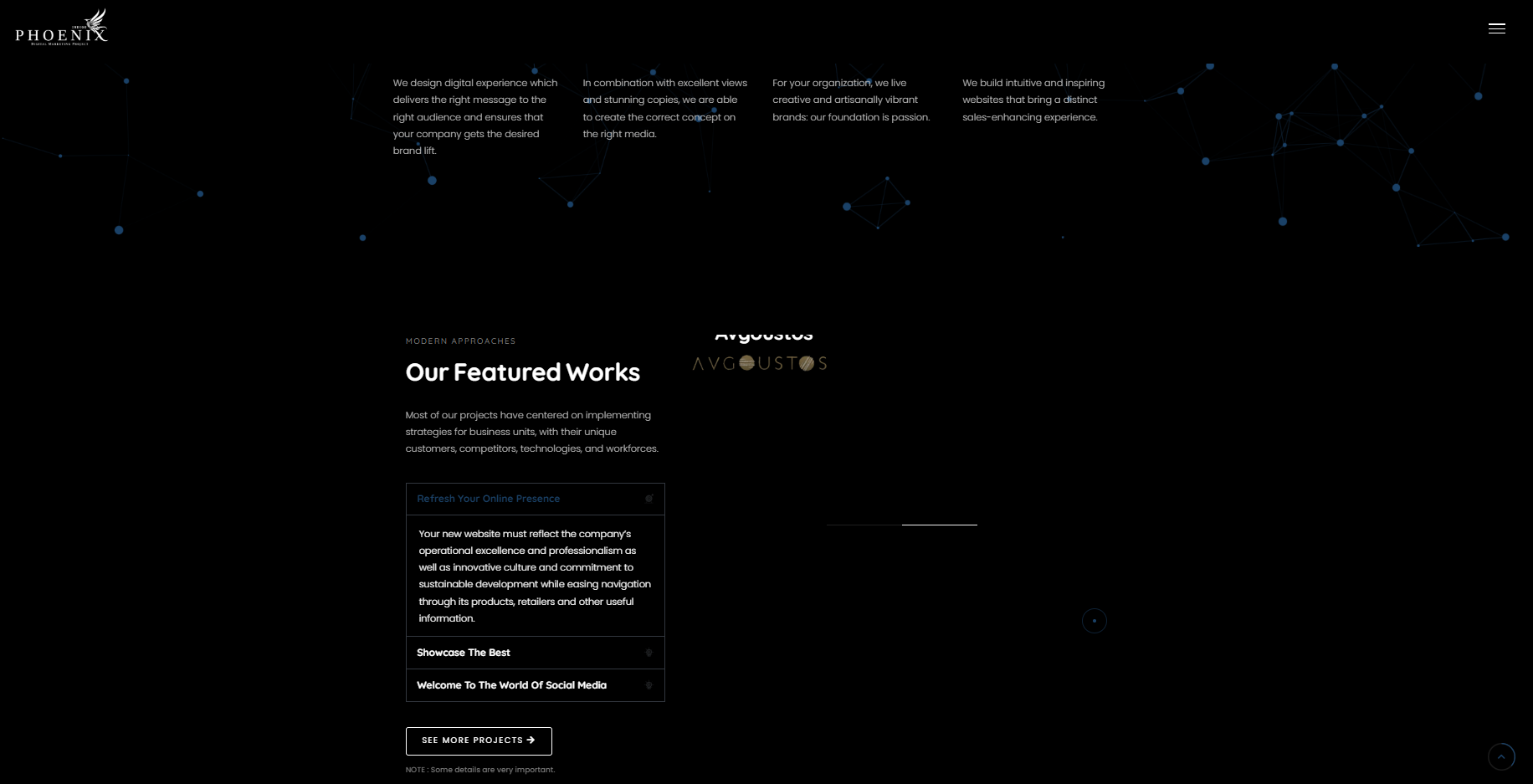
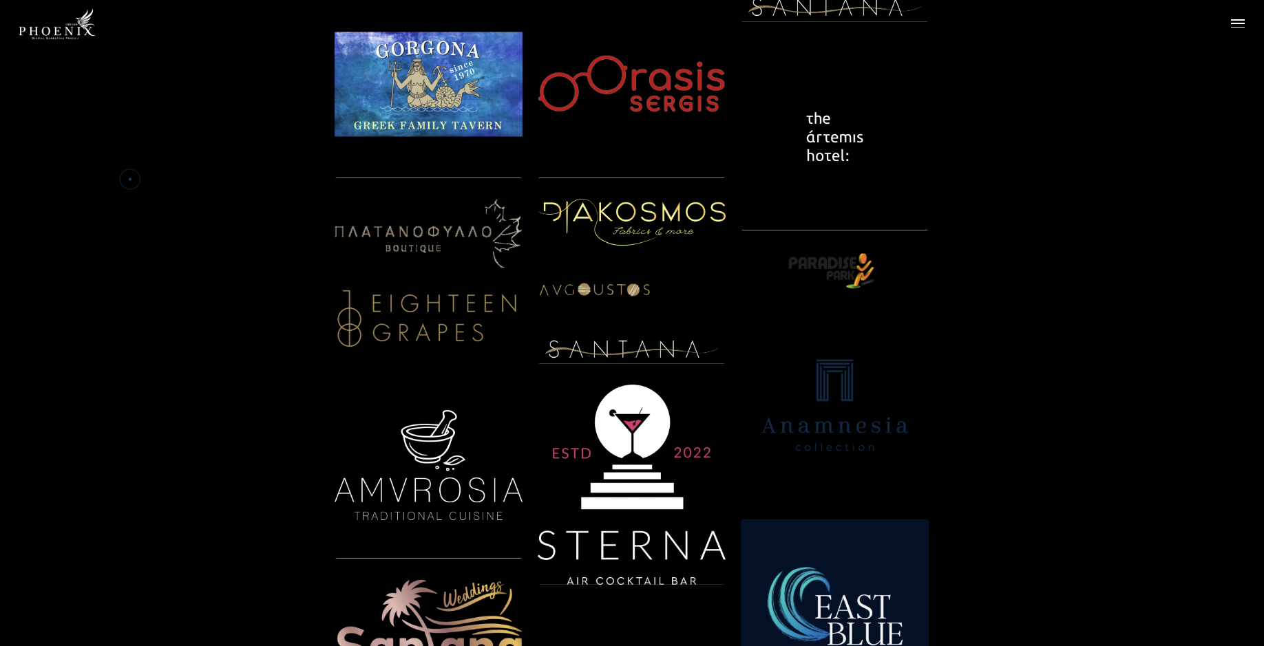
The work page runs on conditional rendering: the same slots can hold a static image, a video, or a full carousel depending on what a given case study needs. Nothing about the layout is hard-coded to Indigo Phoenix's assets specifically, so onboarding the next brand into the same structure is a content swap, not a rebuild.
Where this goes from here.
The system holds. The next phase is making it easier for anyone to apply correctly, and stretching it to cover a case the current site doesn't yet handle well.
A proper brand guidelines document
Formalize what currently lives across this case study, logo clearspace and minimum size, color usage, type pairing, tone of voice, into a single reference doc anyone on the team (or a future vendor) can follow without guessing.
Stories, reels and presentation templates
Extend the reusable post system above into story-format and reel cover templates, plus a slide template for how the brand presents itself externally in decks and proposals.
A small motion language
Beyond the logo animation, transition and micro-interaction rules for reels, site, and presentation use, so movement feels considered rather than one-off.
Expand the site as needs grow
Add sections and pages as the studio's own needs surface. The current build covers the essentials, not the ceiling.
A second case-study format, for brands built from scratch
The current work page template is built around a before/after: it assumes an existing brand the studio improved. But a meaningful share of their work is building brands from zero, where there's no "before" to show. That needs its own case-study logic, process and exploration forward, rather than a comparison that doesn't apply.
Dos and don'ts list for the brand
Write the actual dos and don'ts list for the brand (logo use, color, type, photography, case-study format) once the guidelines doc above is underway.
None of the above blocks what's already shipped. The identity, the live site and the social system all stand on their own today. This is the list for making the system easier to extend, not fixes to what exists.